
Solo Exhibition
Triumph Gallery Moscow Russia
08 August 2013-
01 September 2013
"Trained as a graphic designer, Pavel Brat works as he was taught, with printed publications. But he is by no means a designer in the usual sense of this word. As representatives of this profession are meant to, Pavel works with visual-communicative environments, but he approaches them in a highly artistic manner. Here we could engage in lengthy and highly dubious discussions of why design isn’t art or why, on the contrary, art is design, but that’s not what is important here. What’s important is that Brat, a graphic designer by education creates attractive and very adequate objects for the interior from paper on a firm aluminum base. At the same time, the Brat who is an artist by calling, manages to upend all concepts and techniques, sharply breaking off the usual train of thought followed by the viewer. Let’s just run through this in order.
Firstly, there is the technique. The technique in the works of the new project “Body Mass” are listed as collage. If we can overlook Jasper Johns and Robert Rauschenberg with their pop art approach (despite the source material being glossy magazines, Brat makes no references to pop art, to feminism or to Greenpeace), and instead directly examine the sources of applied mastery, then we shall have to reconsider the works of Kurt Schwitters, a German artist who raised composition with garbage to the rank of what is certainly High Art, embodying, through the subtle combining of heterogeneous components, the absurdity of life and a universal weariness. It was Schwitters who invented the term “merz”, itself a collage of the Saxon words “kommerz,” “schmerz”, and “herz” – commerce, pain, heart. And here the difference between the approach of our contemporary Brat and Schwitters, who has long been considered an innovator, becomes clear. The former is entirely unconcerned by the real foundations of the technique – garbage. What’s more, the glossy pages used by the artist for his works are not only rarely collected from friends and garbage dumps – often they’re actually bought direct from newspaper stands, excluding any hint of “arte povera” and the technique’s inherent revulsion for commerce, the multiplication of essences and the excess of products and production in the world. Signs of pain and melancholy in Brat’s refined tondi or in the weighty “sculptures” are also not easily found. Only the “heart” remains. But here too Pavel has his own approach. The heart is a cosmogony, the five elements, earth, water, wood, metal and fire, alchemy in all its beauty, abandoned to the production of just one glossy page of a magazine. It transpires, then, that in its original essence, any printed publication is already something of a higher order. And is the creation of something of a higher order not the ultimate goal of the artist?
Secondly, there is the content. To the cosmogony mentioned above we can clearly add icon painting, religion and the history of culture. A magazine page itself reflects the tastes and interests of modern man. The artistic will transforms the content into an abstract paste which, in turn, takes on “body mass” through the absorption of water, creating an artistic material from a cultural product. Then this mass fills up a mold which, instead of supporting the abstract essence of the process, pulls towards the figurative. As the author himself explains, “circles turn into haloes, the mass of magazines bound within them – in the concentration of the Holy Spirit and the mortal flesh that bears it.” It turns out that Brat’s works, without any direct secondary elements in the composition, are expressive and even loquacious. And this is “the real deal.” The ability to see in a combination of given colors an image is a sign of artistic mastery. An ability to enter into a conceptual dialogue with that image is a sign of a modern artist. Although Pavel Brat himself has been educated as a graphic designer. Here we could engage in lengthy and highly dubious discussions of why a designer isn’t an artist, or why, on the contrary, an artist creates design, but that’s not what is important here."
What made you become an artist?
Somehow during the second year of studying graphic design I realized that I wanted something more, that I wanted to communicate with the world in a language that could be understood even by those who canТt talk. And perhaps IТd developed an understanding of design as a craft and a rejection of a situation where you were being told what you had to do. That was in September of 2005, if IТm not mistaken. In fact, five years later as part of my diploma I presented a typographical project with a font that IТd developed, and all that happened not under pressure from the teachers but from without, from a love for quality glossies.
Could you give us a description of your technique? How did you develop it?
Basically, during that same period I started to think about which language I wanted to talk in, what to depict and so on. I didnТt have any money for paint or canvases, so I immediately decided to look for other options. And anyway, I didnТt really understand what was going on back then, I didnТt understand why it was all so expensive, I really didnТt understand anything about it, I knew nothing about modern art or the scene. So, it was then that I found my paints in glossy magazines, already printed and ready to be used. I think it would probably be more interesting to talk about how I came to what I was going to depict that would be more interesting than yet another УRussian poverty styleФ story. At the basis of all the works and the project over the course of two whole years lies the culture of the National Bolshevik Party with all the consequences that arise from that. My entire discourse is also founded on religion, its history and its culture. The technique is collage. Having begun with collage as a technique, I moved on to collage as a genre, and then I managed to combine them Ц I managed to break free of flatness and move on to volume. Now my collage technique is a combining of a technical method, in which the color in the paper is perceived as a means for the development of mass and the filling in of the drawing, with a genre in which there is an intentional collision of realities and new meanings arise as a result of that. And there is no talk of recycling or anything like that here, I donТt do that, I donТt resurrect rubbish and I donТt care about the environment. The bulk of the glossy magazines that I use were bought and not found at rubbish dumps. ItТs important when the material that you take avoids the stage where itТs put into circulation, and itТs immediately used for something major. Objects made from paper came later and were based on a physical similarity between earthly and paper masses.
The layers of magazines that you use in your work create an impression of another reality. Could you explain the idea that this approach conveys?
The physics of the mass of the Earth and of paper are very similar, and thatТs where the result of each project involving this technique comes from, as well as the ideas that are born within them. In this project rather than working with paper, which is what everyone sees in the first instance, IТm actually working with the pressure that arises during the course of the work, deforming it and creating the image. Paper is constructed in such a way that upon water coming into contact with it the water is absorbed by it, and as a result a huge amount of pressure is created within a confined space. ItТs that pressure that creates the reality on the surface, filling the entire space, or coming out of it, if there are no spaces of this kind, turning into volume, although it already has its own volume. Paper creates in this dance of pressure the structures that the Earth creates when the continental plates collide. And here everything becomes horribly banal and formalistic if you donТt start to think about an understanding of the stratum of the glossy magazine as a structure, the essence of which isnТt just an earthly mass Ц itТs also our society as a whole. A grey, featureless mass, each sheet having been processed by hundreds of people working in the sphere of the production of images of luxury, slowly moves, filling up the entire space, and it canТt be stopped. ThatТs where the name of the project comes from, УRevolt of the MassesФ, something that in our everyday lives everyone ascribes to revolutionary fashion, not wishing in any way to understand the essence of this reference. УLa rebelion de las masasФ is, I think, one of the fundamental works of the Spanish philosopher of the beginning of the 20th century, Jose Ortega y Gasset, and itТs not about revolution at all, and itТs not even about the consumer society. УRevolt of the MassesФ is an understanding of the extinction of the elite and of a transition.
Tell us about the idea for and the history of the development of the Body Mass project.
УBody MassФ developed out of the УRevolt of the MassesФ project and is a part of the latter. It got its name from the transfer from abstraction to figurative images, or I would even say from an attempt to make that transfer. I studied at a provincial higher education institute as a designer, and they taught us all manner of things there. Basically, they even taught us icon-painting, and not on some superficial level, they taught it very seriously Ц no doubt they thought that it would be of use to us on the market for design services. Yeah, right. The history of icon-painting, with all of its philosophy, lay at the foundation of the searches in this project. Circles turned into haloes, the mass of magazines bound within them Ц in the concentration of the Holy Spirit and the mortal flesh that bears it. An attempt to express the body and the soul, their fusion and their contrast, lost in modern, profane icon-painting, found a place in the entire project which, towards the end, again returned to abstraction, having gone full circle.
Your collages are going to be presented at the exhibition. What are they about? How are they linked to your objects?
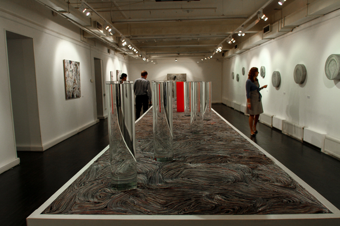
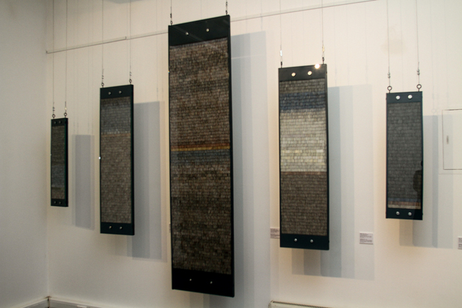
These projects are like two branches in my work, growing out in different directions. TheyТre united, no doubt, by the fact that the objects in masses of paper I link with the social, and, as with classical collages, they become a statement on social processes and a reflection of them. ItТs specifically collage in its classic sense that is a collision of realities to create a surrealist image that always reflects society, itТs created out of images that are created by society, after all. A limited quantity of collisions is always a purity of speech, a purity of statement on something specific. But there can be more of such collisions Ц two, three, four. In this project I can have thousands of collisions of this kind, and they turn into a chaos that itТs impossible to take in, and you certainly canТt find within it authentic collisions that form an essence. Here, the genre element transforms into technique, and moving away from a surrealist game, the spectator begins to perceive this chaos as a unified whole. Although this path can be traveled in the opposite direction. From surrealist chaos, from the shining images of fresh glossy magazines, I create threatening clouds, and they become a symbol of the heavens, or to be more precise, a symbol of the perception of the heavens in our society. A heaven of abundance, beauty, riches, hanging over the viewer, ready to collapse on him with all of its weight as soon as he understands what is hidden behind those clouds, or the spectator can soar over this chaos and see something more, something less perceptible than the world of things. As you can see, there are different paths here.
Are there other approaches or techniques that you use in your work? Could you tell us about them in more detail, including the installation with water?
The installation with water is actually an installation with paper and water, itТs an allusion to the Last Supper, itТs the УHour Before MidnightФ installation (I actually took it from Igor Letov, though I donТt know exactly which context he took it from) Ц I use the same approach in the whole of the УRevolt of the MassesФ project. In this instance the installation isnТt just an image of the earthquake on Mount Calvary, itТs also an image of the changing of the entire world, the changing of society. Paper under the influence of water (depicting biblical sacrifice and lamentation) revives and gives and gives birth on its surface to reliefs in the same way that they are born on the Earth under the same influence of pressure.


© Foto by Triumph Gallery